Date: July 2017 | Role: Lead UX | App, IOS, Android, Dating
-01
Overview
-01
Overview
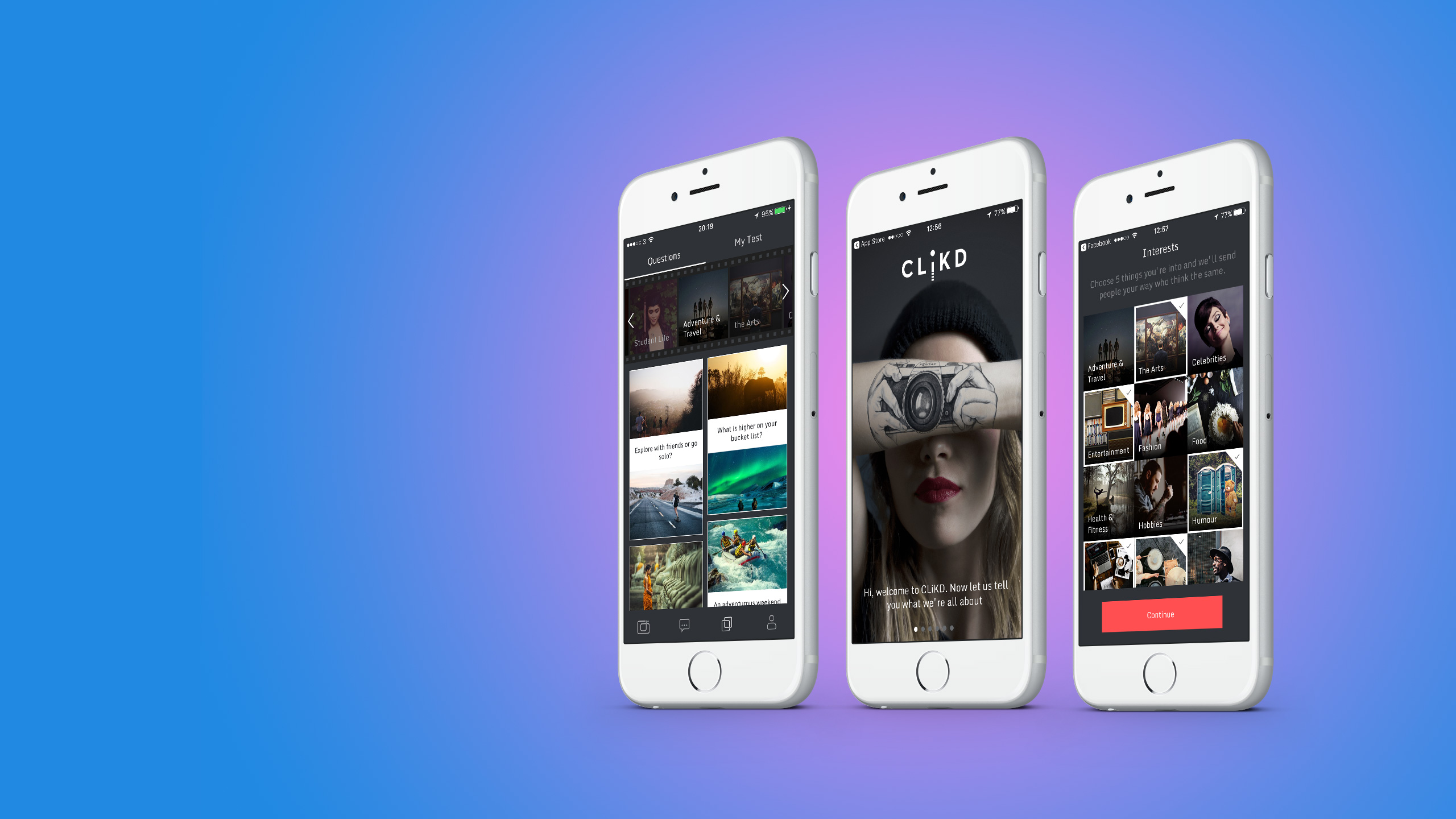
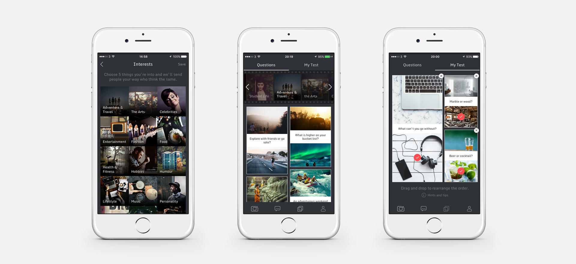
By trying to remove the ‘superficial’ aspect associated with other dating apps, CLiKD uses fun, photo-based quizes that allow users to like-minded people. Only 20 recommendations based on pre-defined requirements were presented to the user each day to keep retention levels. Tapping on a person’s profile would launch their photo-based quized and once matched, users could then make contact with one another.
-02
My role
-02
My role
I came on board only a few days before the launch of the app as UX Lead. A beta version had been live for a few weeks with some mixed reviews and a low user base.
With a go-live date already in place, I quickly made some quick recommendations to improve the app before launch. I then used a more iterative approach to make improvemens through research and testing to help grow our user base.

-03
Challenge
-03
Challenge
I came back on board 2 weeks after launch and I was curious to see the numbers. It was slow but steady – hardly anything to write home about. With access to the logs and Firebase, we were able to see that retention was low; users weren’t doing as many tests as expected; and they weren’t nudging other users once they had completed their quiz.
Adjustments to the algorithm were also critical as it had been unchanged since first implementation.
Nudges
Nudges are important to the app as it is a means of allowing users to say to someone “I’ve completed your test” rather than inundating users with notifications. It allowed users to make a move if they wanted to on their own terms. The logs showed that nudges counted for only 5% of all activity on the app and of all the tests passed, 23% of actions led to a nudge.
Retention levels
Our logs showed that retention levels for repeat visitors dramatically decreased beyond the first week. We could see a flurry of activity withi the first week. however week 2 would show only 19% retention, and week 3 only 11%.
Distance radius
Our user base were complaining that a vast majority of their recommendations were located far away.
We used Facebook to populate a users profile with information, such as profile images and their STATIC location.
However the app itself used GPS to list recommendations based on a user’s requirements, meaning that although a recommendation was actually close by, because their static location was listed as another city confused our users.
Another important note that when we first launched with a limited user base, a decision was made to set the default radius of a user’s location search to 100km+ which meant that recommendations were in fact based all across the UK.
-04
Solution
-04
Solution
We used Lean UX techniques to test our assumptions to see if we could meet our desired outcomes and followed a Build-Measure-Learn loop relevant to the Lean Start-up philosophy to test our hypotheses and determine if we move forward or we look for another solution.
Nudges
Our assumption was that the term ‘Nudge’ was a little forceful. It implied a physical notion (though in a digital environment) and felt more of an command rather than a suggestion. We conducted a small whiteboard session for 15 minutes and used word association to come up with more user-friendly terms. We dot voted the best term and quickly implemented it into the live enivornment where we could easily measure its success.
Retention levels
Speaking with some of our audience revealed that the quizzes were becoming a little too repetitive as they were encountering the same questions on a daily basis.
We believed that by creating themed questions based on current topics, we could increase the number of tests taken and retention levels heading into week 2 and 3.
Distance radius
We quickly came up with a couple of hypotheses baed on user feedback:
1. By removing Facebook’s static location and displaying the user’s current GPS then we could potentially reduce customer feedback
2. By changing the default distance within the app from 100km+ to within 40km, we could again reduce customer feedback and give a more accurate list of results
-05
Results
-05
Results
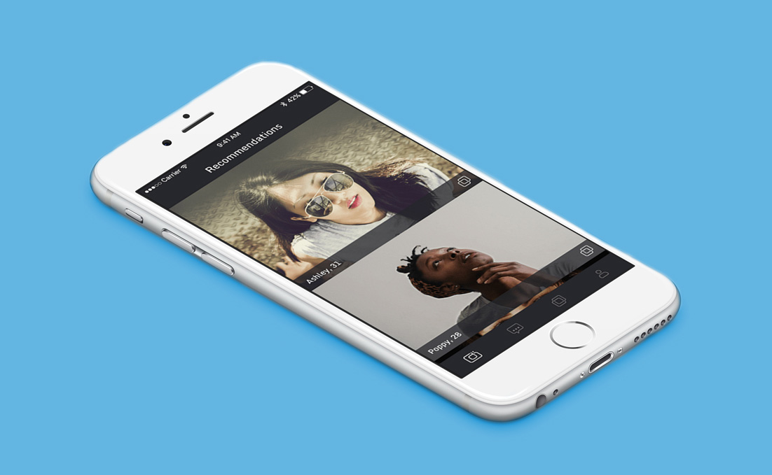
Nudges
Within a couple of days of implementing, we saw the number of interactions almost double and now 44% of tests passed lead to a user Saying Hi. We were thrilled that such a small change made such a big impact!
We are currently repeating this process and feel we can go well beyond 44% with the next round of amends.
Using ‘nudges’
Nudges
No nudges
Saying hi
Saying hi
Not saying hi
Retention levels
A few weeks after introducing current themed questions, we saw a sharp rise in retention levels for repeat visitors in week 2 to 54% and week 3 to 31%.
Further more we saw a rise in tests taken of 162%. That number has now averaged around 110% in the 3 weeks since this was introduced.
Distance radius
We are currently implementing these hypotheses into the app and so will be able to see results and learning very soon. We are very confident that these simple fixes will address these issues.