OVERVIEW
Better consumer flow with the launch of a new mini store format in high traffic areas
Better consumer flow with the launch of a new mini store format in high traffic areas
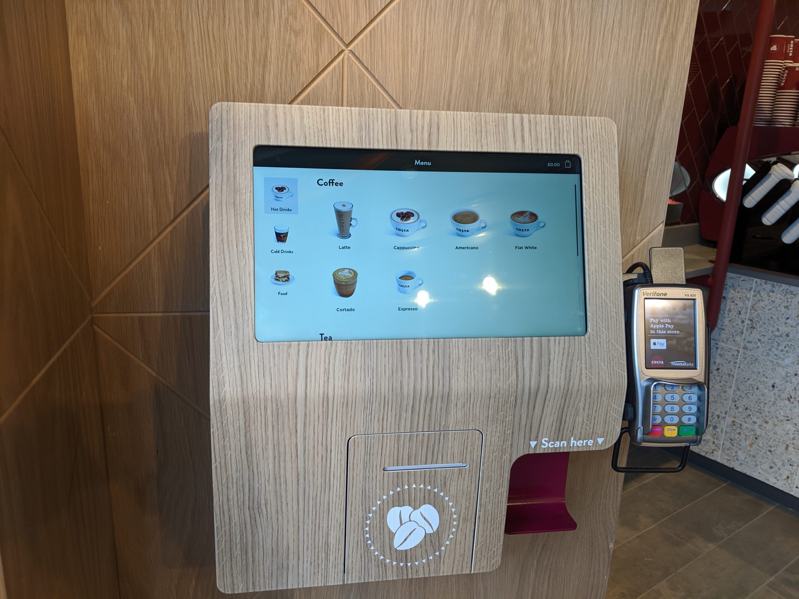
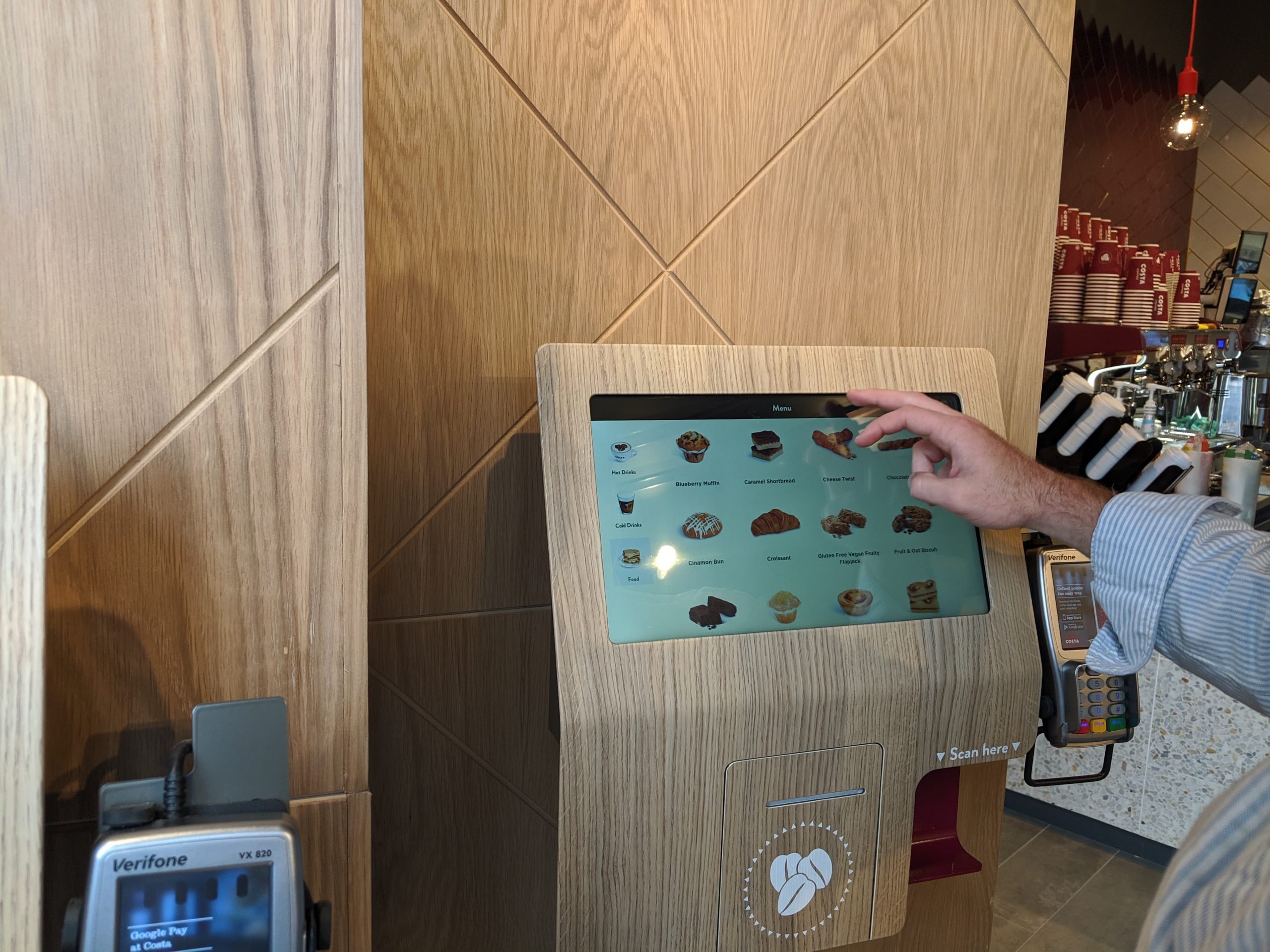
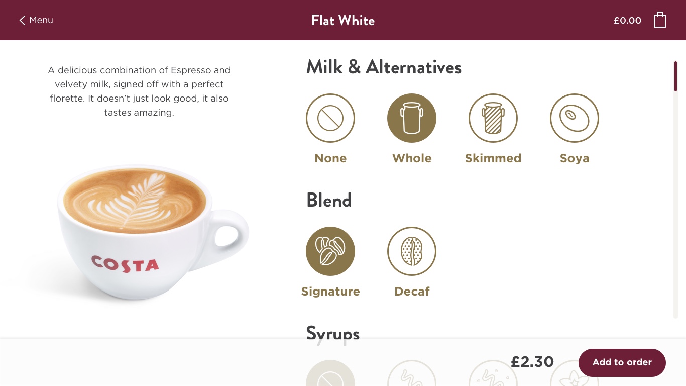
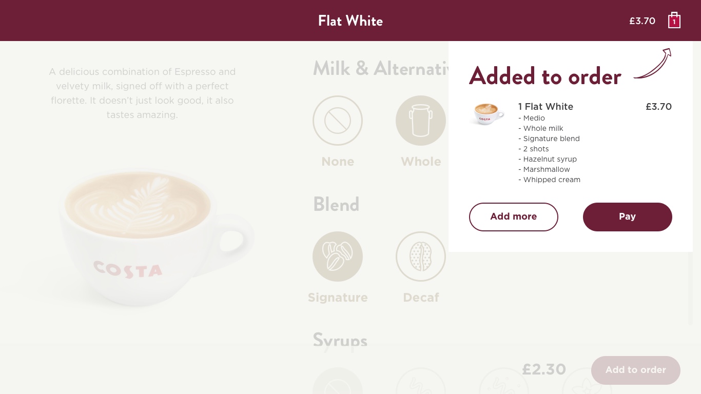
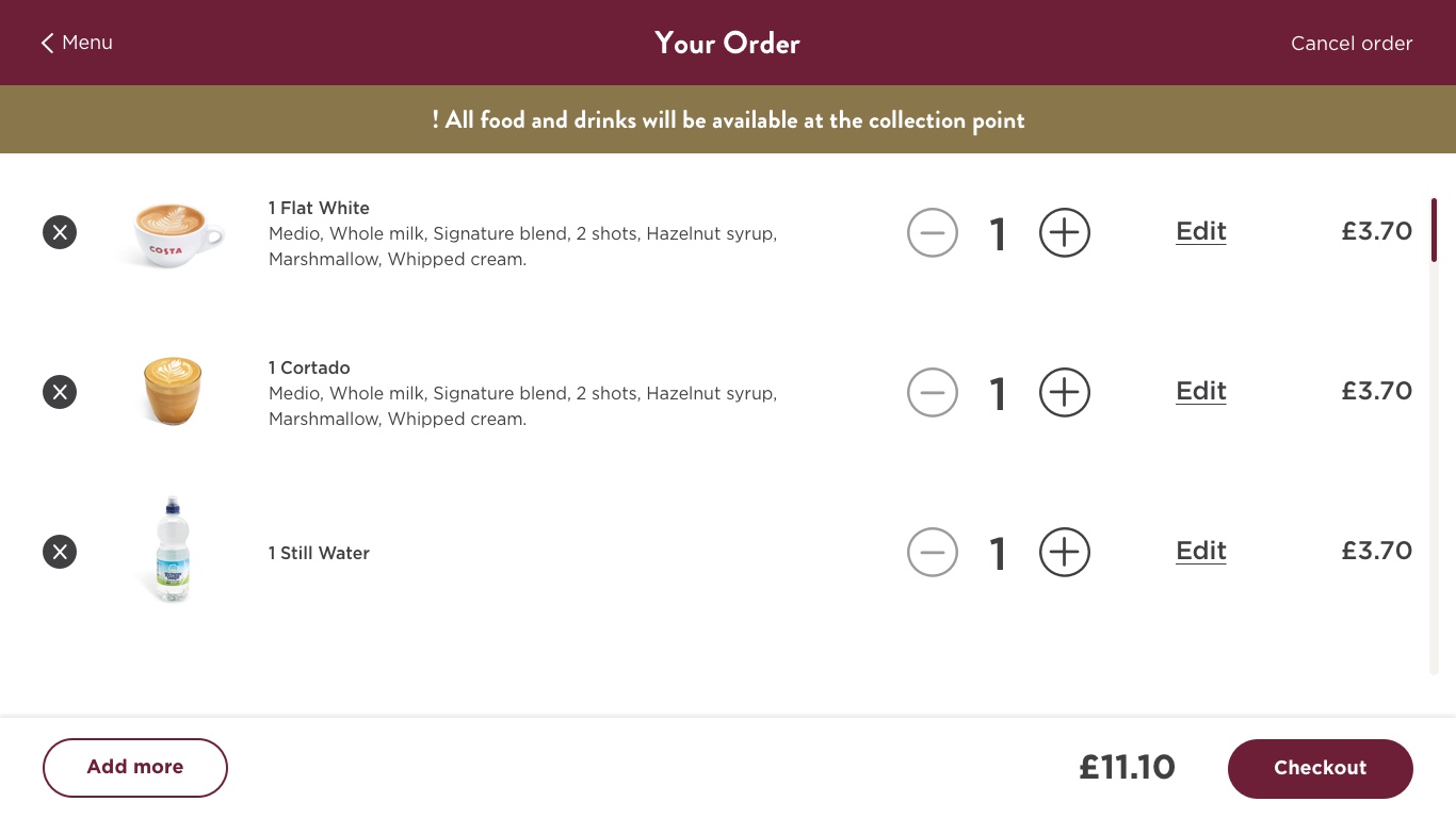
Costa Self-Order Screen
Lead UX/UI, Research
Better consumer flow with the launch of a new mini store format in high traffic areas
Costa Self-Order Screen
Lead UX/UI, Research
-01 Overview
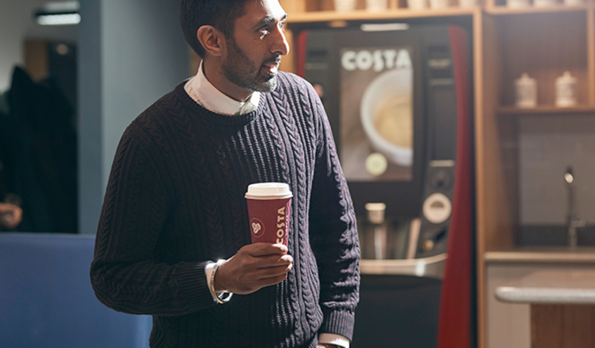
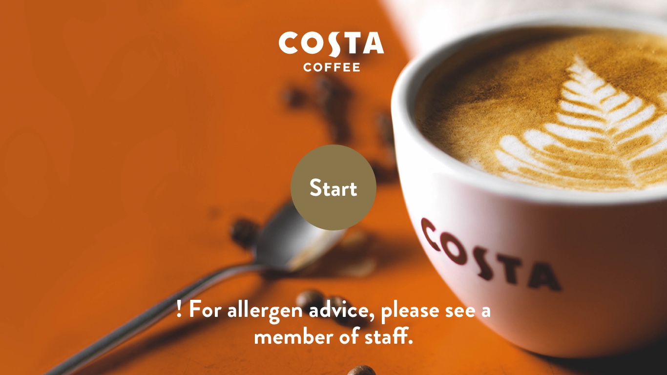
Costa are always striving to serve our consumers high quality coffee faster. It takes our consumers an average of around 3 minutes to order and leave with their favourite drink. Our aim is for our consumers to be able to order and collect their drink in 2 minutes.
Ambitious? Maybe.
With the launch of the new Mini Store Format (MSF) in high traffic areas (mainly station platforms), there was an opportunity to trial a digital solution to help eat into that time.
SPOILER ALERT: We didn’t crack the 2 minute mark. We weren’t expected to. But did we reduce the ordering experience time?
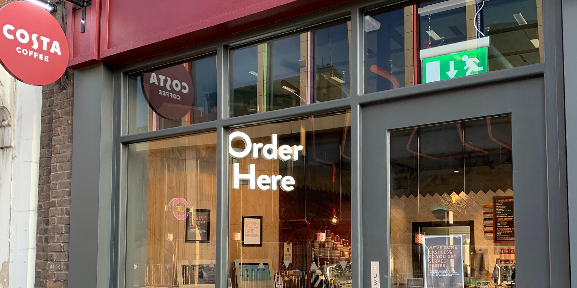
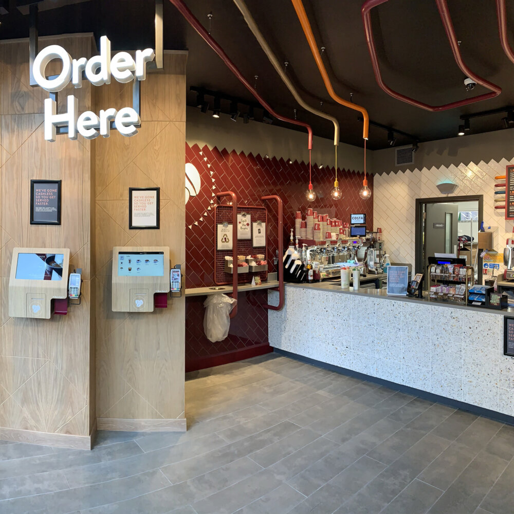
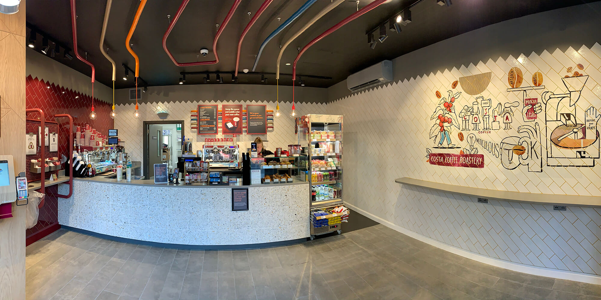
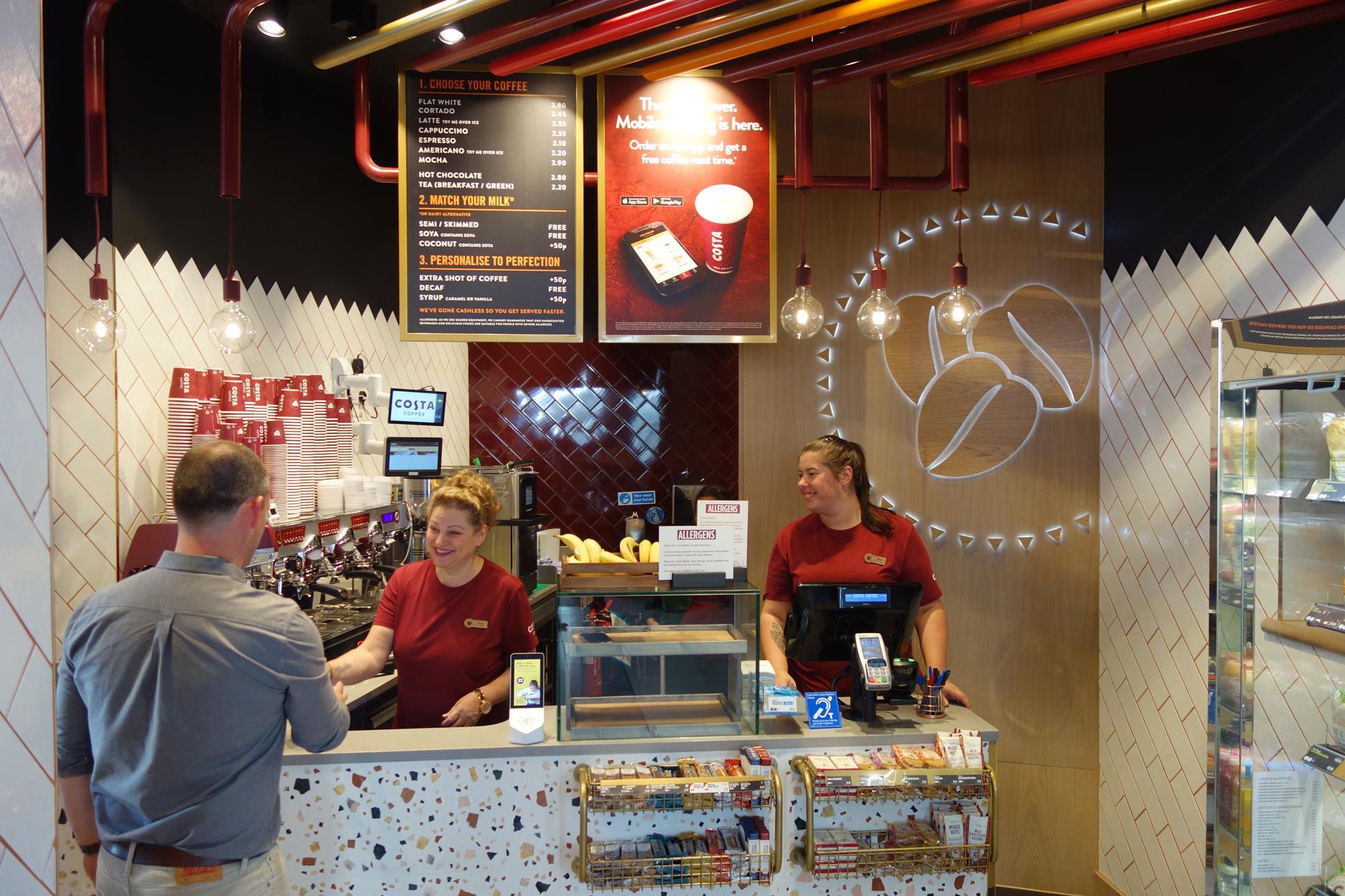
Costa Mini Store in Lewisham
Costa Mini Store in Lewisham
-02 Customer research
Research is always conducted with our key persona, Alex (our morning commuter). All our experiences are based on Alex’s needs (depending on the work that is taking place).
Alex – morning commute
Alex is time poor. He usually visits our stores more than twice a week on his way to work. Because his commute into London is, as he describes it, “HORRIFIC”, his coffee is his reward to the rigours of his journey. He usually orders the same drink, rarely deviating from his preferred usual. He sees his coffee as a needed pick-me up to help him function.
We enlisted the services of Method to assist in breaking down the ordering experience and finding the customer pain points during the full ordering experience – from when they first arrive till they leave our stores.
The team observed customers flow through a number of similarly sized stores – roughly averaging 3:15.
We found that Alex didn’t mind waiting for his coffee once he had ordered. His biggest pain was actually queueing to give his order. When asking Alex what would help him in this instance, another method of ordering would would alieviate.
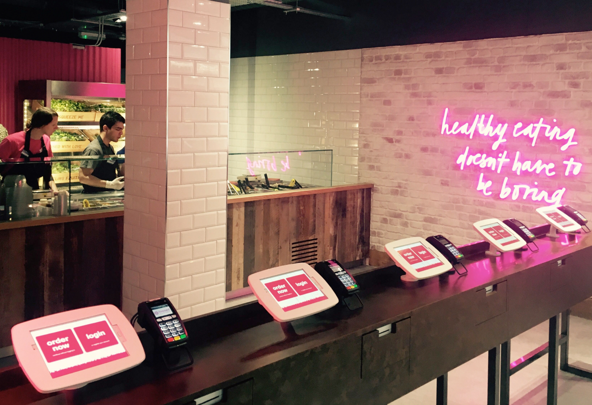
Through this, 2 digital experiences were discussed to help Alex; a self-order screen (SOS) or portable tablets with baristas taking orders from the queue.
Given the increase in head-count being too costly, the SOS was the digital touch-point to be explored.
The 7 touch points of the ordering experience

Approaching – seeing how busy the store is

Queueing – joining the end of the queue

Ordering – Barista taking the order

Paying – transaction is taking place

Waiting – order to be called out
Receiving – Barista handing over coffee

Leaving – exiting the store
Average ordering experience time
We enlisted the services of Method to assist in breaking down the ordering experience and finding the customer pain points during the full ordering experience – from when they first arrive till they leave our stores.
The team observed customers flow through a number of similarly sized stores – roughly averaging 3:15.
We found that Alex didn’t mind waiting for his coffee once he had ordered. His biggest pain was actually queueing to give his order. When asking Alex what would help him in this instance, another method of ordering would would alieviate.
Through this, 2 digital experiences were discussed to help Alex; a self-order screen (SOS) or portable tablets with baristas taking orders from the queue.
Given the increase in head-count being too costly, the SOS was the digital touch-point to be explored.
The 7 touch points of the ordering experience
Approaching – seeing how busy the store is
Queueing – joining the end of the queue
Ordering – Barista taking the order
Paying – transaction is taking place
Waiting – order to be called out
Receiving – Barista handing over coffee
Leaving – exiting the store
Average ordering experience time
-03 A collaborative effort
Our methods of research and testing
-03 A collaborative effort
Our methods of research and testing

Competitor analysis

Collaborative workshop

Rapid prototyping

Lab testing

iTab
Competitor analysis
Collaborative workshop
Rapid prototyping
Lab testing
iTab
Competitor analysis
We went out and observed and tested everything out there. McDonalds, Burger King, KFC, Tossed, even Starbucks in Canary Wharf. Tossed seemed to be the one competitor that resonated more with our product. They were using a small touch screen unlike the big, front of store types seen in fast food outlets. What was immediately clear was the end-to-end user journey was mostly the same. There was no need to re-invent the wheel.
Collaborative workshops
Gathering the product and digital portfolio teams along with 3rd party developers, we defined the business goas and the problem we were solving for; what we knew of the user; and our constraints. We mapped some use cases and journeys then sketched some screens.
Collaborative workshops
Gathering the product and digital portfolio teams along with 3rd party developers, we defined the business goas and the problem we were solving for; what we knew of the user; and our constraints. We mapped some use cases and journeys then sketched some screens.
Rapid prototyping
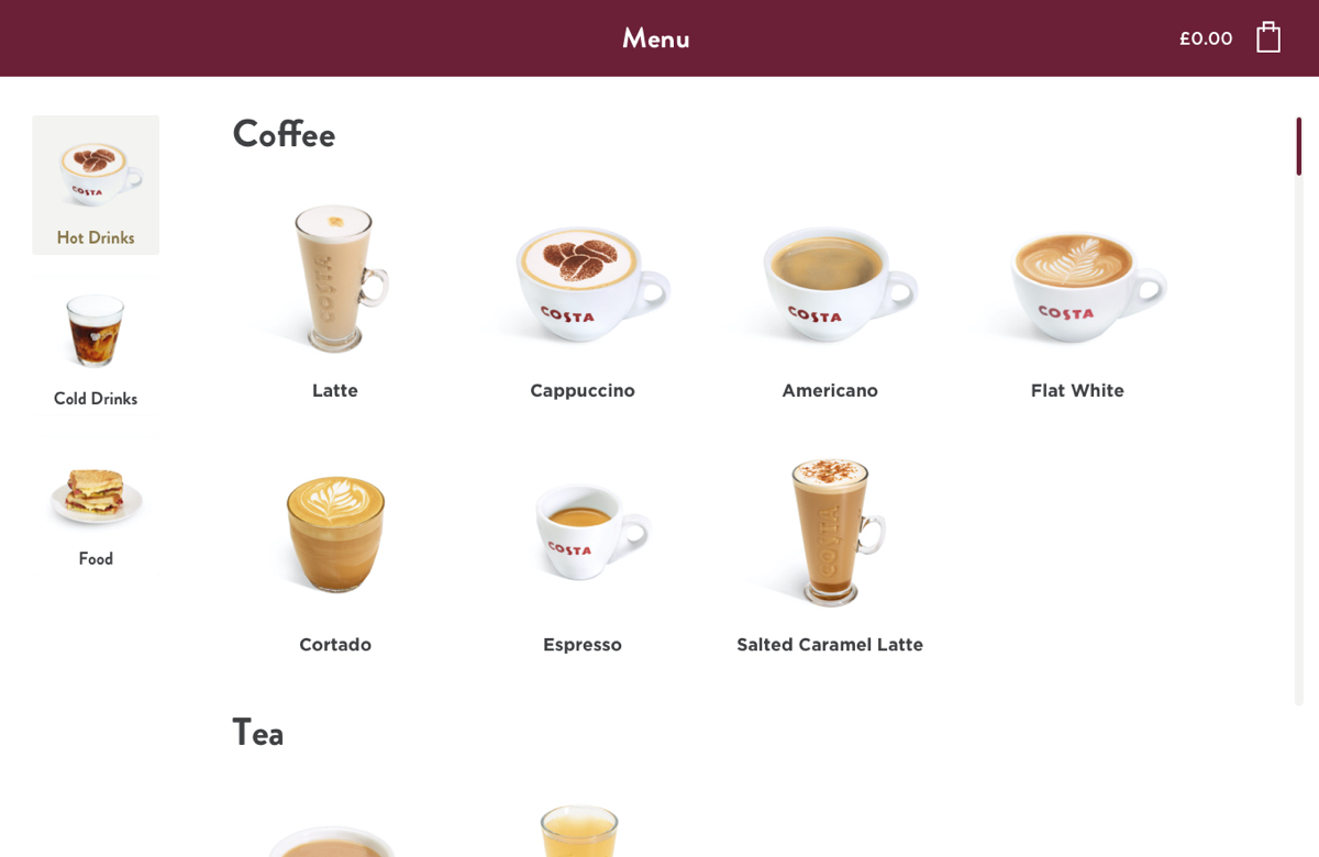
I put together a prototype using components from our design system and shared it with the teams. We went through each stage of the journey to ensure there were no technical limitations missed.
We were then ready to conduct our user testing.
Rapid prototyping
I put together a prototype using components from our design system and shared it with the teams. We went through each stage of the journey to ensure there were no technical limitations missed.
We were then ready to conduct our user testing.
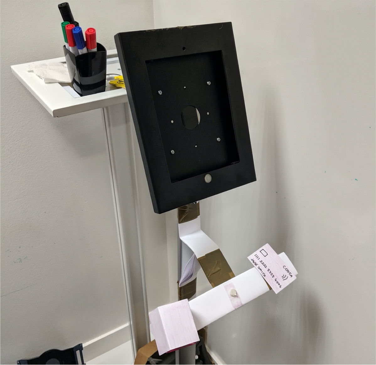
Lab testing
We conducted in-lab testing within our offices with our Alex personas. The prototype was incorporated into a stand and I used cardboard to build (with my enthusiastic kids) the loyalty scanner and payment terminal to simulate the real ordering experience.
What became immediately clear was that participants were treating the SOS like a mobile device; meaning that they expected certain CTAs in areas where they would be located on mobile devices.
What we did see was in certain tests, some users managed to order their standard favourite drink in under 50 seconds. I’ll caveat that with a reduced time with the simulated payment journey, however a great leap towards reducing that ordering experience time as users were able to navigate through the flow efficiently.
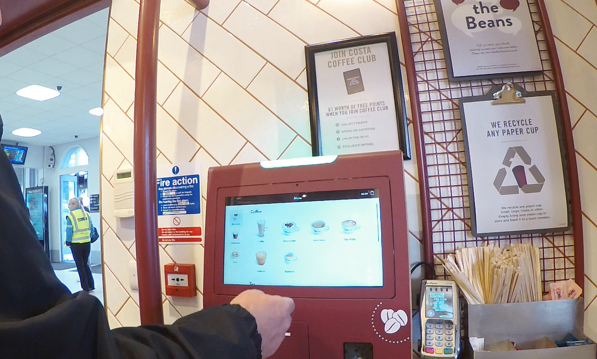
iTab
Our iTab facility allows us to build mock stores using modular elements. Once the floor-plan has been developed, our team within iTab build the internal store to scale.
The benefit iTab had for user testing was that it allowed us to mock up our first trial store (in Lewisham station) to scale. We then ran a bunch of different scenarios with real baristas and customers, simulating peak times to measure how many coffees can be served during those time periods.
In one particular scenario, we allowed customers to order from the till, the SOS and using Collect on the app. We found that the baristas had some initial trouble when the 3 different order types arrived on their monitor. There was no way of distinguishing which order type was which. With the help of the baristas, our solution was to use colour and a code so they could distinguish between the different order types.
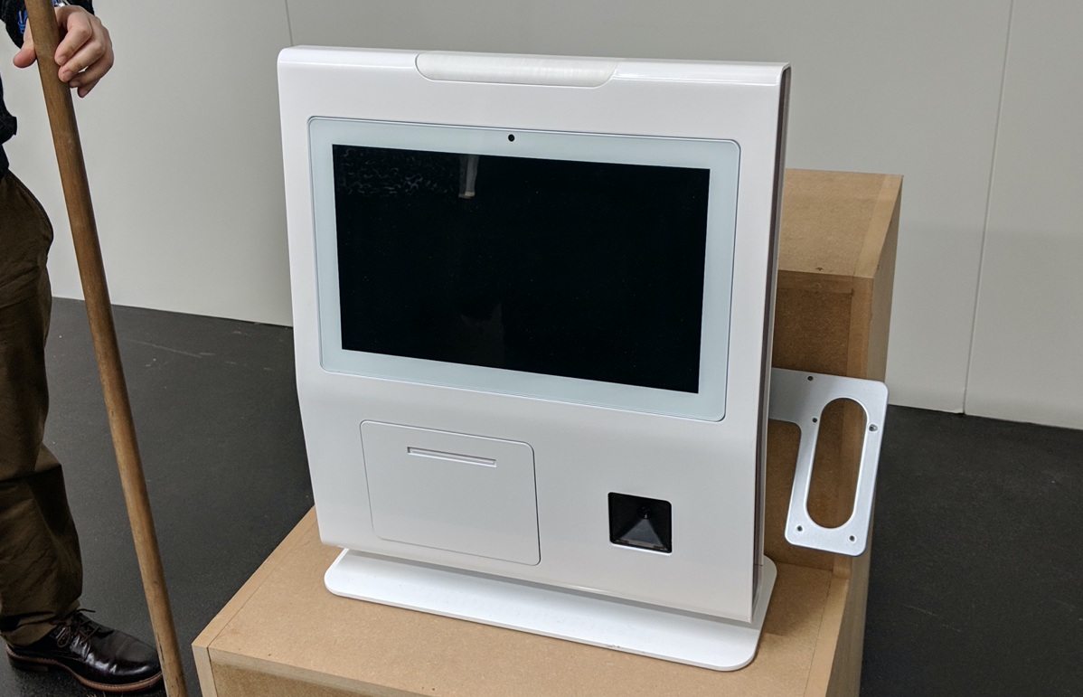
-04 Testing in-store
We set up our stand with prototype in the middle of our store in Farringdon during peak traffic hours. We first stood out of the way to see if customers would understand what it was and if they could use it.
To simulate a real-world scenario, once a customer had interacted with the prototype, we would write the order down and hand it to a barista to make the drink.
We noticed customers observing others using the SOS to determine ease of use before using it themselves. When we asked why, the response was they didn’t want to look “silly” if they couldn’t use it.
Feedback was good and customers found it easy to follow.
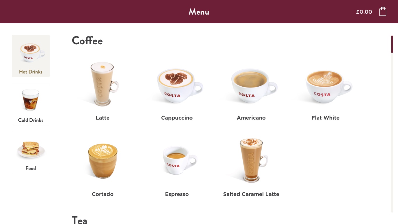
-05 Design
We had enough evidence now and we finalised the design for the development team to build the product.
-06 Launch & monitoring
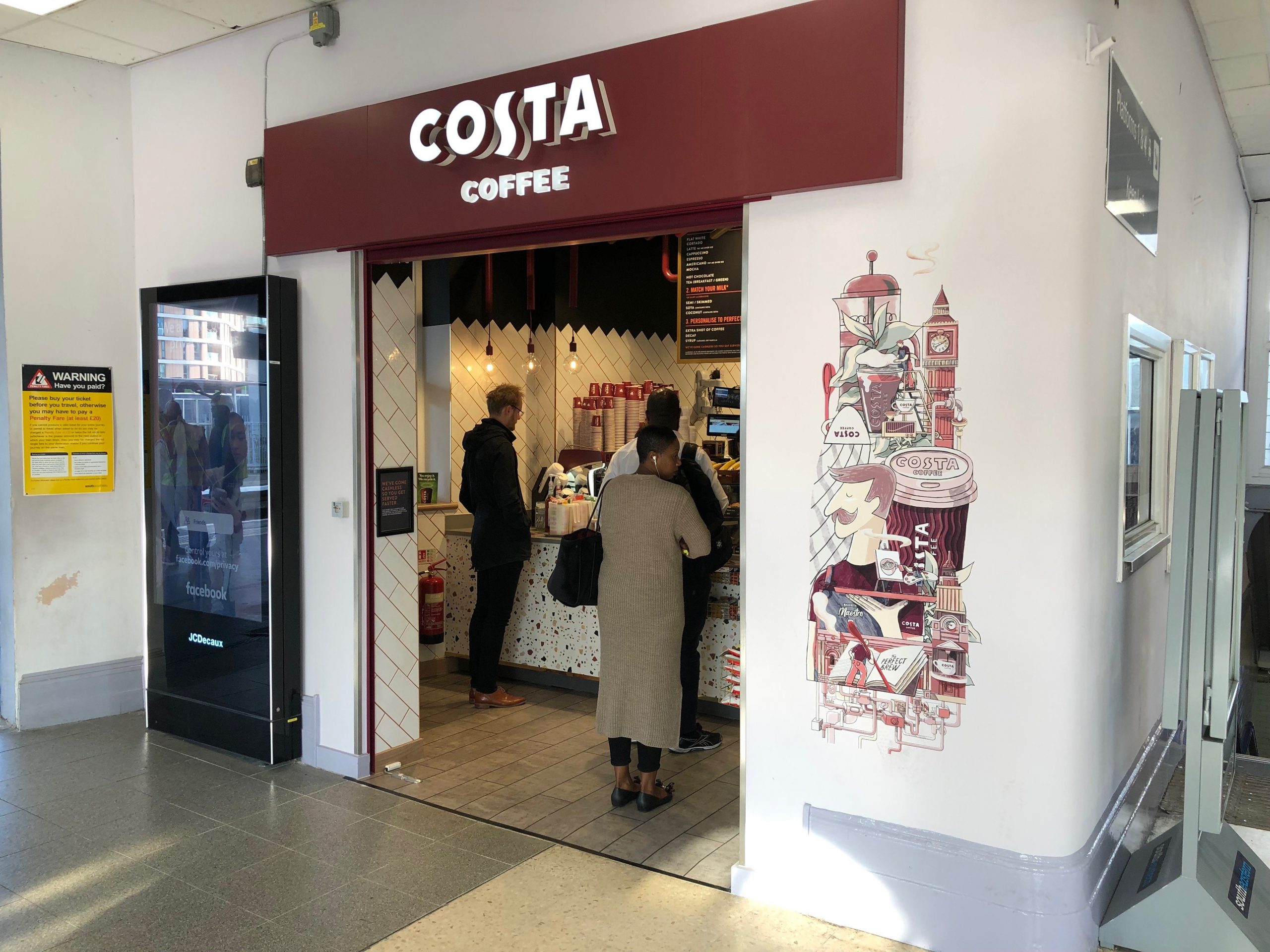
Given the success during our testing, it was decided that the SOS would be launched in 3 test stores – Farringdon, Lewisham Station and Vauxhall Station. We celebrated! Some press coverage for our trial.
In the first few weeks of launch, the SOS averaged around 7% of total orders – rising steadily week-on-week. Feedback from our barista’s was mostly positive however we noticed a 35% abandoned rate mostly on the menu screen.
We decided to schedule in an in-field observation and testing session to find out what caused that abandonment rate.
A separate case study will detail the testing and Day 2.
We’re still working on tracking an accurate average time across the 3 trial stores. Factoring in the API calls and the struggle with connectivity in train stations hampered the experience.
However early tests have indicated that we’ve been tracking around 2 minutes and 31 seconds in our Farringdon store where connectivity isn’t an issue.
-07 The metric
We managed to reduce the timing of the full ordering experience. There’s a catch. We have tested this in one store based on 1 product per order. However this still bears relevant to our Alex persona who orders 1.1 drinks per order.