OVERVIEW
Designing an experience for the US, scaling to other international markets
Designing an experience for the US, scaling to other international markets
Costa Global Express Machine
Lead UX/UI
Designing an experience for the US, scaling to other international markets
Costa Global Express Machine
Lead UX/UI
-01 Overview
Until very recently, the Costa Express business had sat as a separate entity under the full Costa Coffee family. Digital experiences for the Express machine were designed by external agencies, bringing a disconnect with our brand and customer experiences with our broader digital platforms.
In our bid to take over the world, there had been a directive to push the Costa brand into the US market as we expanded our global reach. The Express machine was to be Costa’s first entry into the market.
-02 No Christmass break…
When reviewing the end-to-end experience, we found the design wasn’t fit for our US audience, and the agency neglected user testing of the experience.
It was approaching Christmas when we decided to take control of the project. With only 3 weeks to deliver a user tested end-to-end experience, senior leadership wanted to outsource again.
However I was eager to take this on and cancelled holiday plans with the in-laws…
-03 Research & findings
Our methods of research and testing
-03 Research & findings
Our methods of research and testing

Customer insights

Collaborative workshop

IA

Rapid prototyping

Remote Testing
Customer insights
Collaborative workshop
IA
Rapid prototyping
Remote Testing
Customer insights
I immediately contacted our US team and asked for every bit of consumer brand insight we had for the market.
Our audience hadn’t had much experience in using automated machines that brewed freshly roasted coffee beans – they were used to the filtered stuff you’d expect from places like McDonalds.
We needed to showcase premium and quality – both in product and experience.
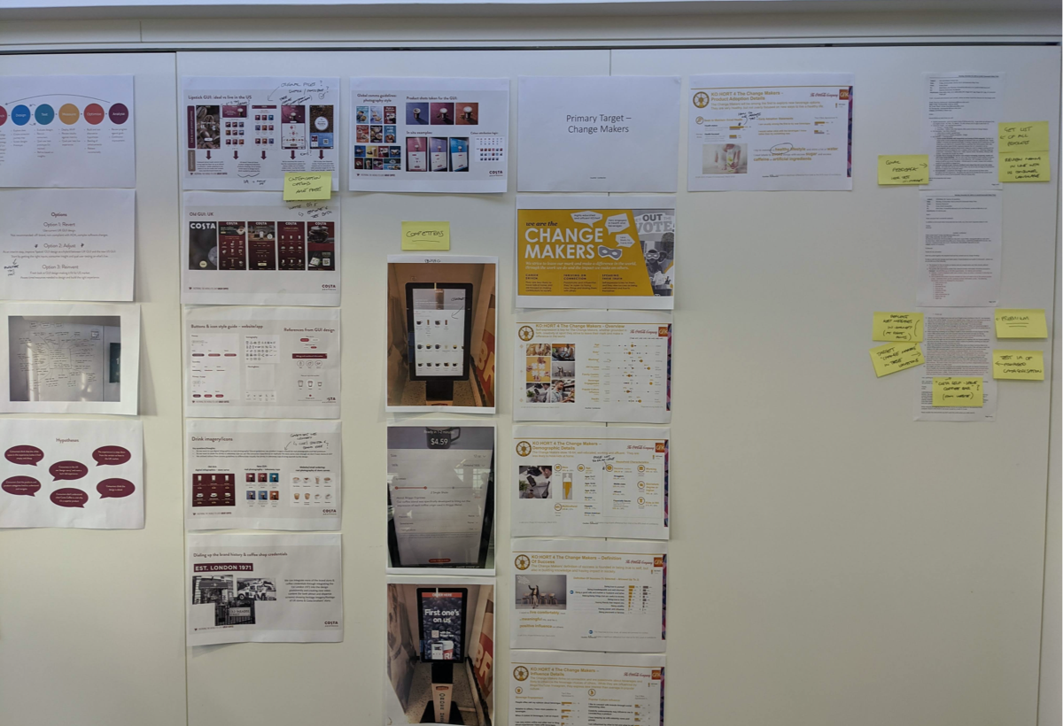
Collaborative workshops
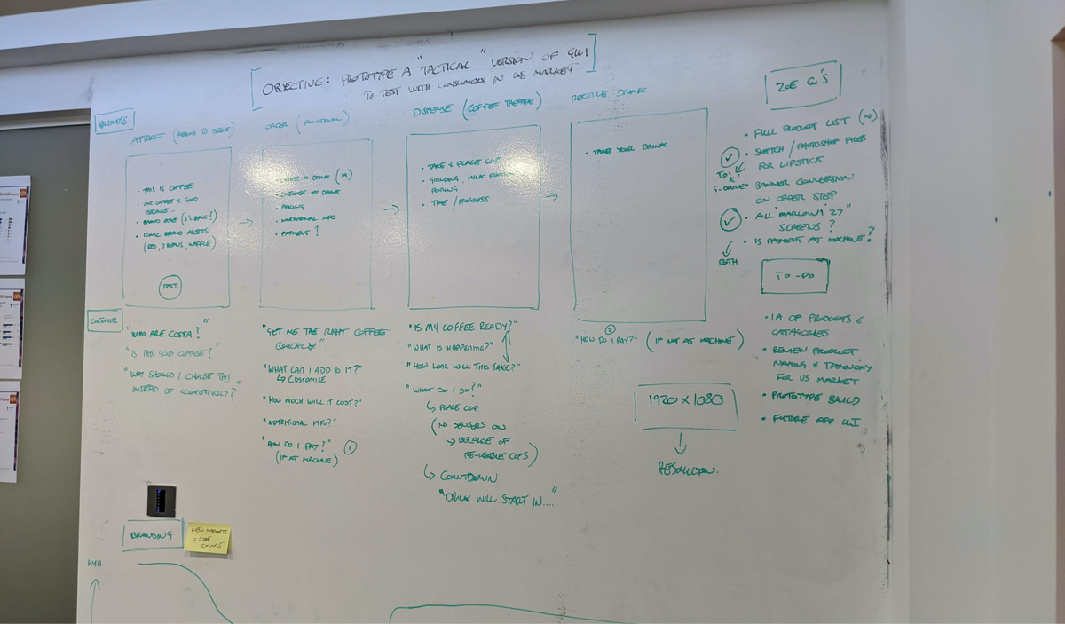
I ran a workshop with the Head of UX, the Product Owner and the Dev Lead. The goal of the session was to define the problem we were looking to solve; the goals of the business; any assumptions to go with what we already new of the audience; and any business and technical constraints.
From this we sketched a few user flows and key screens that I would take into user testing.
Collaborative workshops
I ran a workshop with the Head of UX, the Product Owner and the Dev Lead. The goal of the session was to define the problem we were looking to solve; the goals of the business; any assumptions to go with what we already new of the audience; and any business and technical constraints.
From this we sketched a few user flows and key screens that I would take into user testing.
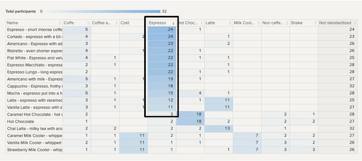
IA
The insights also showed that some coffee names and categories groupings differed to how we saw them in the UK.
So I enlisted our testing partner to conduct and IA exercise remotely with our audience. From the research, we amended some of the drink names and how they were grouped in their categories to ensure our customers knew where to find them.
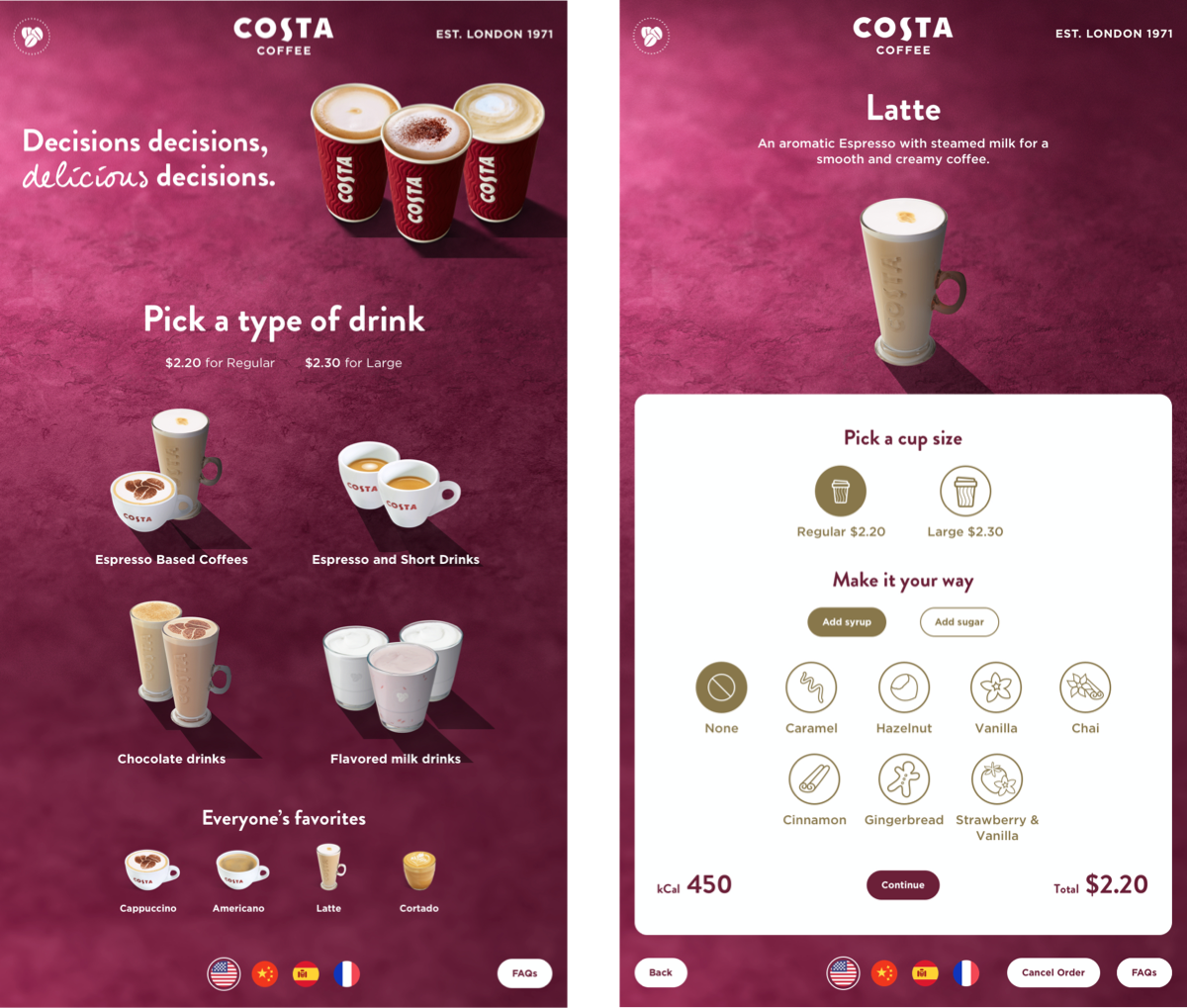
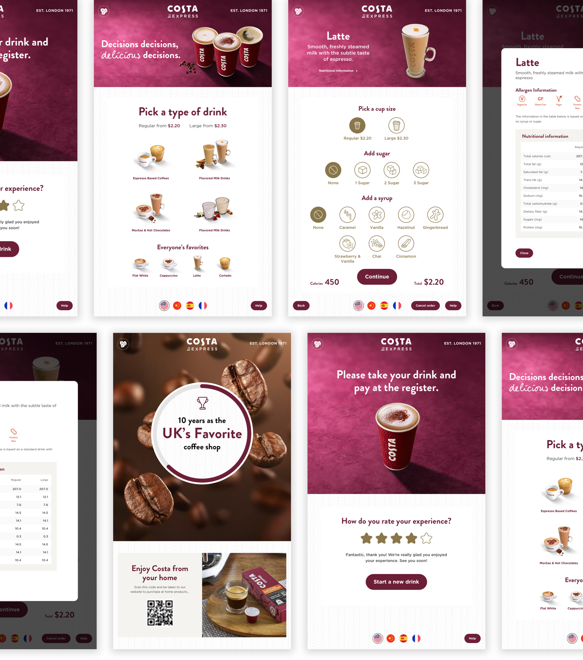
Design direction
Our Global COO who was heading up the project had “ideas” of how the GUI should look and wanted the Costa Red brand to shine through.
Given this was a new product, with a new way of ordering with an audience we only had some insights about, we thought a cleaner UI would be more suited and easier to navigate.
I roughly designed 2 different routes to prototype and test (hence the terrible shadows) – 1 based on exactly what was asked of me (needs more red); the other using elements from the self-order-screen work I had done to align to our digital products.
What I didn’t want to do was to get an opinion on the design. What I was looking for was which GUI was easier for the user to understand and complete tasks.
Needs more red to prototype
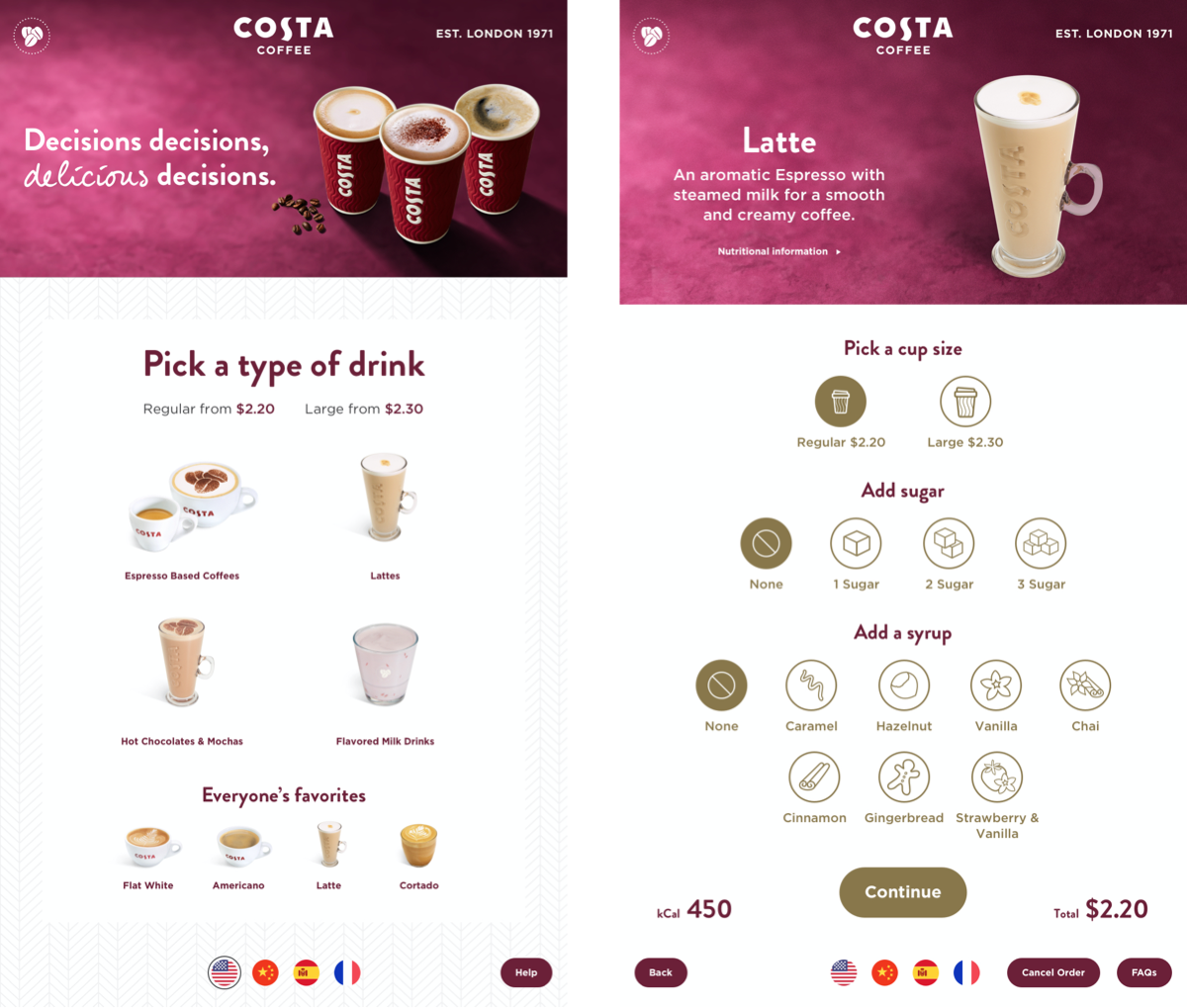
Cleaner UI in-line with core digital platforms
Design direction
Our Global COO who was heading up the project had “ideas” of how the GUI should look and wanted the Costa Red brand to shine through.
Given this was a new product, with a new way of ordering with an audience we only had some insights about, we thought a cleaner UI would be more suited and easier to navigate.
I roughly designed 2 different routes to prototype and test (hence the terrible shadows) – 1 based on exactly what was asked of me (needs more red); the other using elements from the self-order-screen work I had done to align to our digital products.
What I didn’t want to do was to get an opinion on the design. What I was looking for was which GUI was easier for the user to understand and complete tasks.
Needs more red to prototype
Cleaner UI in-line with core digital platforms
Rapid prototyping
I remotely tested both directions with a US based audience. I made each participant aware that this was intended to be a touch screen and showed images of the Express machine that was to house the GUI.
Questions were scenario and narative based in an attempt to get the user into the mindset of being at a physical machine and get them to interact with the product if they came across it in the real world.
To remove bias, I mixed the order of tasks so it wouldn’t skew findings.
-04 Design
When presenting the findings, the COO was happy to adopt the cleaner UI. We made some minor amends to designs based on the findings during our user testing.
We made a decision to use crockery for our product shots for a more premium/high quality product.
-05 Launch
Due to the pandemic, launch has been delayed until Q2 this year.